Wednesday, December 12, 2012

Lab 8 - LA Station Fire Spread

August 29, 2009.

August 30, 2009. 

August 31, 2009.

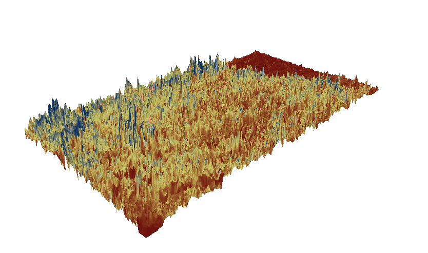
Spread of the 2009 Los Angeles Station Fire.


The Spread of the 2009 Los Angeles Station Fire


According to the Incident Information System, the 2009 Los Angeles Station Fire was the largest fire recorded in the history of the Angeles National Forest established since 1892, and was the tenth largest fire recorded in California history since 1933. The Station Fire, which started on August 26, 2009 at approximately 3:30 PM was very devastating and led to a few deaths, multiple injuries and thousands of evacuations. Once the fire was finally contained, the cause of the fire was determined as arson. The fire spread rapidly over the course of the next few days.
Weather conditions on the day the fire was reported tended to be warm and dry with light winds. Vegetation moisture levels were relatively low and moisture content in chamise was over 60%, a critical level for wildfire. Upon arrival, personnel found fire burning on the upslope side of the Angeles Crest Highway. Terrain was extremely rugged and steep, making it hazardous for fire fighters. Spot fires started to occur on the down slope of the Highway within minutes and temperatures were beginning to exceed 100 degrees Fahrenheit. By August 27, there were multiple spot fires continuing to occur. Firefighters had to leave the scene due to extreme fire behavior.
By August 30 and August 31, the Station fire threatened about 12,500 homes in the San Gabriel foothills. The fire was about 5% contained as of August 31. Two firefighters were killed the night before as their vehicle fell down a slope while trying to escape the fire. As of August 31, two lives were lost, over 100,000 acres burned and 21 structures were destroyed. Extremely high temperatures and steep slopes coupled with chaparral and dry grass fuelled the fire. By September 1, 2009, 22% of the fire was contained with 127,513 acres burned according to the Incident Information System.
As of September 26, 2009, 98% of the fire was contained. The fire was finally fully contained around 7 PM on October 16, 2009. However, full control of the fire, or fire out with no heat, lasted a few more months. The Station Fire containment date was pushed back multiple times due to stubborn hot spots, rugged and steep terrain, high temperatures and low humidity. As of November 5, 2012, fire fighters continued to mop up the 132 mile containment line that the fire burned. According to the US Forest Service, by the time the fire was contained, the fire burned about 161,000 acres. About 154,000 acres of forest land was destroyed along with about 6,700 acres of private lands. The fire also destroyed 89 residences, damaged 13 residences, destroyed numerous forest service structures, destroyed 26 commercial buildings, killed two individuals and injured many others.
As depicted in the map above, the 2009 Station Fire was devastating and impacted a major area. On August 29, the fire was very close to a recreation area. However, the fire was relatively small in comparison to its overall spread. The fire spread very rapidly over the course of the next several days. The fire resulted in the closures of major forest highways and roads the following day. By September 1, 2009, the fire spread rapidly through the Angeles National Forest. Thankfully, the fire didn’t flow much further into urban areas, as depicted by the map above. Nearby hospitals were able to resist damages and only one recreation area was really close to the fire.


Bibliography

Archibold, Randal. Weather Lends a Hand Fighting California Fire. The New York Times, 01 September 2009. Web. 10 December 2012. <http://www.nytimes.com/2009/09/02/us/02fires.html>.

CNN. ‘Angry fire’ roars across 100,000 California acres. 31 August 2009. Web. 10 December 2012. <http://articles.cnn.com/2009-08-31/us/california.wildfires_1_mike-dietrich-firefighters-safety-incident-commander?_s=PM:US>.

Incident Information System. Station Fire: Incident Overview. 26 September 2009. Web. 10 December 2012. <http://www.inciweb.org/incident/1856/>.

Incident Information System. Station Fire Update Sept. 1, 2009. 02 September 2009. Web. 10 December 2012. <http://inciweb.org/incident/article/1856/9374/>.

Incident Information System. Station Fire Update Sept. 27, 2009. 26 September 2009. Web. 10 December 2012. <http://inciweb.org/incident/article/9640/>.

PBS News Hour. Thousands Evacuate as Calif. Fires Spread. 31 August 2009. Web. 10 December 2012. <http://www.pbs.org/newshour/updates/weather/july-dec09/fires_08-31.html>.

US Forest Service. Angeles NF – Station Fire: Burned Area Emergency Response Implementation: Frequently Asked Questions. United States Department of Agriculture, 04 November 2009. Web. 10 December 2012. <http://www.fs.usda.gov/Internet/FSE_DOCUMENTS/fsbdev3_020019.pdf>.

US Forest Service. Fire and Aviation Management: Station Fire Initial Attack Review. United States Department of Agriculture, 13 November 2009. Web. 10 December 2012. <http://www.fs.fed.us/fire/station_fire_report.pdf>.

Monday, November 26, 2012

Lab 7 - Census

Dear Anna,

I just spent the last 3 hours trying to join the Asian, Black and Other tables with the county shapefile but had no success. I tried downloading the excel to DBF converter and various other methods but the values kept coming out as "null." After talking with about 5 other students who were working on this lab, no one was able to figure out how to get the values to actually come out rather than being "null." I know it's my mistake for not attending section and asking you questions, but hopefully you can give me some partial credit. I just found maps online regarding Asian, Black, and Other populations, as our maps should be identical to these. Thanks!


This is the sample map for Number of People that we had to create (Felt like I should include this to show that I did try...)


The map above details Asian population percentages in the United States. The map shows that there is a heavy Asian population in the West and East but not in the Central United States. This may be because there are many Asian immigrants who land on either the West and East coast and choose to settle there. Many Asians may tend to prefer on the coasts rather than inland.


The map above details the Black population in percentages across the United States. This map reveals that there is a heavy Black population in the South-East. The West does not have a heavy Black population but in California, there is. Unlike Asians in the United States, the Black population is also a lot greater for there is more density. This demographic cluster may be due to the US' past history with slavery.


The map above is that of Some Other Race population. This map shows that "other races" are heavily found in the West and are scattered everywhere in the United States. This makes sense for the United States is basically a salad bowl of numerous races and ethnicity's. People are bound to be scattered everywhere.


Overall, I learned a lot from GIS and was fascinated by its ability to create eye-pleasing and very complicating but useful maps. However, I really did not like the fact that one had to have instruction in using ArcGIS and had to be technically savvy. I just spent the last three hours trying to join the table to the shapefile and had no success. I ultimately felt like I was wasting my time trying to figure out something that possibly might not ever work. I wasn't sure if I was inputting my data incorrectly or formatting my excel sheet in the wrong way. Whatever the matter, the program itself became very frustrating. However, if one is technically savvy and becomes used to using ArcGIS, I believe the possibilities are endless. Overall, GIS is a very useful tool. Anyone can use it and pretty much everyone does. The only thing interesting is the limitations of GIS. I believe in the future with greater technological innovations, GIS can take map-making and analyzing to the next level and I am quite interested in how this field will develop.

Monday, November 19, 2012

Lab 6 - DEMs in ArcGIS

3D

Aspect

Slope

Hillshade above DEM


This area that I chose to work with for this lab was contained in the zip folder on the class website. The extent data is as follows: Top: 39.829, Left: -105.788, Right: -104.949, Bottom: 39.3838. The geographic coordinate system for the Aspect map is -1 minimum and 359.99 maximum with a mean of 158.55 and a standard deviation of 106.456. The geographic coordinate system for the Slope map is 0 minimum and 30093600 maximum with a mean of 2609061.88 and a standard deviation of 1957062.38. The geographic coordinate system for the Hillshade map is 0 minimum and 254 maximum with a mean of 49.04 and a standard deviation of 64.86. The geographic coordinate system for the DEM map is 1558.87 minimum and 4343.74 maximum with a mean of 2516.4 and a standard deviation of 624.929.

Monday, November 12, 2012

Lab 5 - Map Projections

Behrmann: 8,763 miles

Bonne: 6,731 miles

Equidistant Conic: 6,972

Equidistant Cylindrical: 5,061

Hotine: 9,629

Stereographic: 9947

Map projections are important for every single map projection distorts distances in some ways. It is important for people to understand that it is impossible to accurately flatten out a 3D area such as the earth. Therefore, there will be distortions depending on the type of map projection one chooses to use. There are no limitations to map projections and people may choose to use whichever they like. This may be important to determine average distances and for creating scales on maps. The quality of no limitation on the number of possible map projections is also useful for comparisons and contrasts. As seen above, I was able to choose whichever map projection I wanted to compare distances from Washington DC to Kabul, Afghanistan, all of which are different.

That is why it may be quite difficult for one to know the exact distance to a certain place. Depending on the map, this distance may differ. For instance, the six maps above all have different mile projections from Washington, D.C. to Kabul, Afghanistan. While the most accepted map projection form was the Lambert Conformal, people who do not understand map projections may look at any map and accept the distances to be true. This may be a pitfall of map projections for novices who have no prior understanding of the distortion concept. However, the Equidistant Conic and Bonne seem to have the closest distance projections in comparison to the others.

Further, map projections may be useful for they somewhat maintain the spherical shape of the earth. Maps would also not exist without map projections. A map is a flat representation of the Earth's surface, which is difficult to determine. With map projections, one can as accurately as possible create a flap map. Maps are more convenient and easier to carry than globes. Scales on maps also help people determine distances. In the examples above, each map projection maintains the spherical shape or either distorts land masses to fit accordingly to the scale. This maintains accuracy and allows end users to compare and contrast various distorted projections.

However, another pitfall of map projections is that one needs to be technically savvy. They need to understand how to use ARC GIS and the differences of each maps and the reasons for those differences. Thus, one really needs to have a solid understanding of map projections, differences and technology. It was a bit difficult at first for me to get used to the program, and it still is. If it wasn't for step by step directions, this lab may have taken me a lot longer to complete. Further, one needs to be educated about map distortions and projections. Although each projection may be pretty in picture, one needs to fully understand what each projection is doing, how it is doing what it is and why.

Monday, November 5, 2012

Lab 4 - Arc GIS

The use of Arc GIS can be very useful in construction planning or work. As this exercise suggests, planners can determine population trends and geographic attributes in planning their construction activity. This way, they can fully comprehend the consequences of their actions before they actually carry their work out. If there are dire potential consequences, they may have to forgo their work and create another, more effective plan. If otherwise, they may be able to continue with their project. One can combine data sets, compare them and also draw useful conclusions.

Arc GIS also lays out everything quite simply. One can look at the map above and not have much questions. Labels make every data set easy to recognize and differentiate one from each other. There is a lot of data above and people can pick and choose data that is useful. Further, color coding and labels make the data easy to read. Individuals can simply look at the labels and scales in order to determine what is what on the map. Little icons and symbols on the Arc GIS map are also helpful to the reader. Although the actual map is very complex and complicated, the end result is easy to use and comprehend.

However, one pitfall of Arc GIS that I found was that it was quite difficult to use. At times I would ruin my whole data by misclicking a certain box option or typing in the wrong data. There are also so many property options, buttons and steps in the actual program. It is at times difficult to keep track of everything and it is easy to make simple mistakes. This makes the program and the end result data prone to errors.

Another pitfall of Arc GIS is that the program is completely computer based. One has to be technically savvy and understand the whole process. The program is also very specific. People need to have the money to buy this program and need to learn how to use it effectively. This may take a lot of time, money and instruction. People who may not really understand computers (perhaps older generations) may have a difficult time even if they are given step by step instructions. If this difficult, it may be even harder to manipulate the program for one's own personal use. It would be hard to create everything from scratch, for I had difficulty even following step by step instructions.

Wednesday, October 17, 2012

Lab 3 - Dynamic Maps

https://maps.google.com/maps/ms?msid=210441587647967623246.0004cc45045442224a443&msa=0&ll=34.046686,-118.391247&spn=0.099991,0.181789


The map I created is a bike route from the Wiltern Theater in Korea Town, Los Angeles to the Santa Monica Pier. I highlight two famous eateries and a few malls and parks that I feel define the route. I chose this route because I used to bike from Korea Town to Santa Monica numerous times and would like to share the route I take.

The potential of neogeography is great. Individuals can create their own map catering to their interests. The creator does not have to be a professional nor do they have to have any experience in map making. They can simply go on google maps and create a map that caters to their interests. They may eliminate landmarks that have no importance to them and highlight certain areas on the map that they particularly enjoy or think is significant. Others may look at this map and visit the places that the creator has marked. Individuals can also include every restaurant or landmark along a certain route and allow the map viewer to choose from a set of options. I believe this aspect of neogeography allows for creativity and a plethora of different maps. Viewers can pick and choose maps that fit their interests or destinations. These maps are also very interactive. Individuals can see videos and pictures to see if a certain restaurant serves delicious looking food or whether a certain park or landmark is worth visiting. These previews are helpful for individuals routing new destinations. Visitors may find these maps quite useful.

However, the pitfalls and consequences of neogeography are also great. Individuals may create maps that are hard to understand or aren't relevant to the viewer. The creator may also have no education and these maps may be created by pure amateurs. Thus, it may not be accurate and it makes one question its reliability and validity. How can one trust a map created by someone they do not know? How can they trust another's preferences? These are questions that remain unanswered. Further, these maps may cater to a specific individual and no one else. Every person has differing preferences and understandings of the world. The fact that neogeography is user-driven makes it prone to biases.

Wednesday, October 10, 2012

Lab 2 - USGS Topographic Maps

1. Beverly Hills Quadrangle
2. Canoga Park, Van Nuys, Burbank, Topanga, Hollywood, Venice & Inglewood.
3. 1966
4. North American Datum of 1927 (NAD 27) & North American Datum of 1983 (NAD 83).
5. 1:24,000
6. a) 1200 meters
    b) 1.89 miles
    c) 2.64 inches
    d) 12.5 cm
7.  20 feet
8. a) 34 degrees 04' North , 118 degrees 26' 15"West
    b) 34 degrees 0' 45" North, 118 degrees 29' 45" West
    c) 34 degress 04' 14" North, 118 degrees 29' 28" West

9. a) 560 feet, 170.688 meters
    b) 150 feet, 42.672 meters
    c) 640 feet, 195.072 meters
10. Zone 11
11. 37(small) 63, 3(small) 61.5
12. 371,612.16 squared meters
13. Wouldn't let me paste, I e-mailed this answer to you.
14. Magnetic North
15. South
16. Wouldn't let me paste, I e-mailed this answer to you.